
Skull Cider Packaging
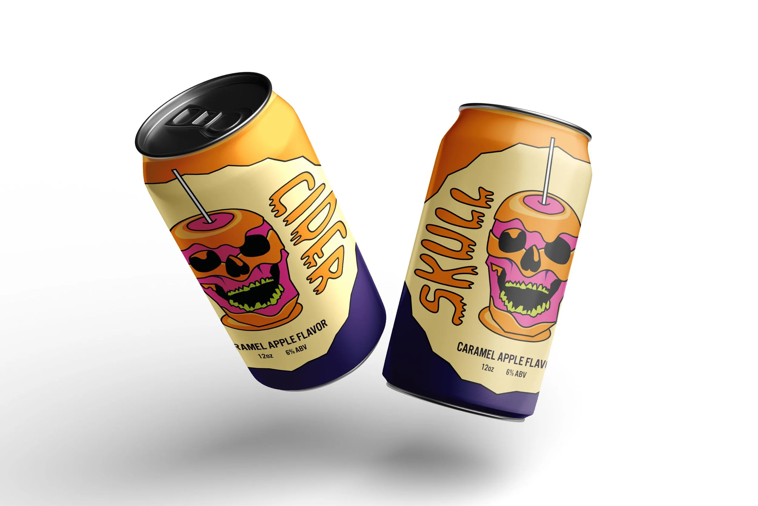
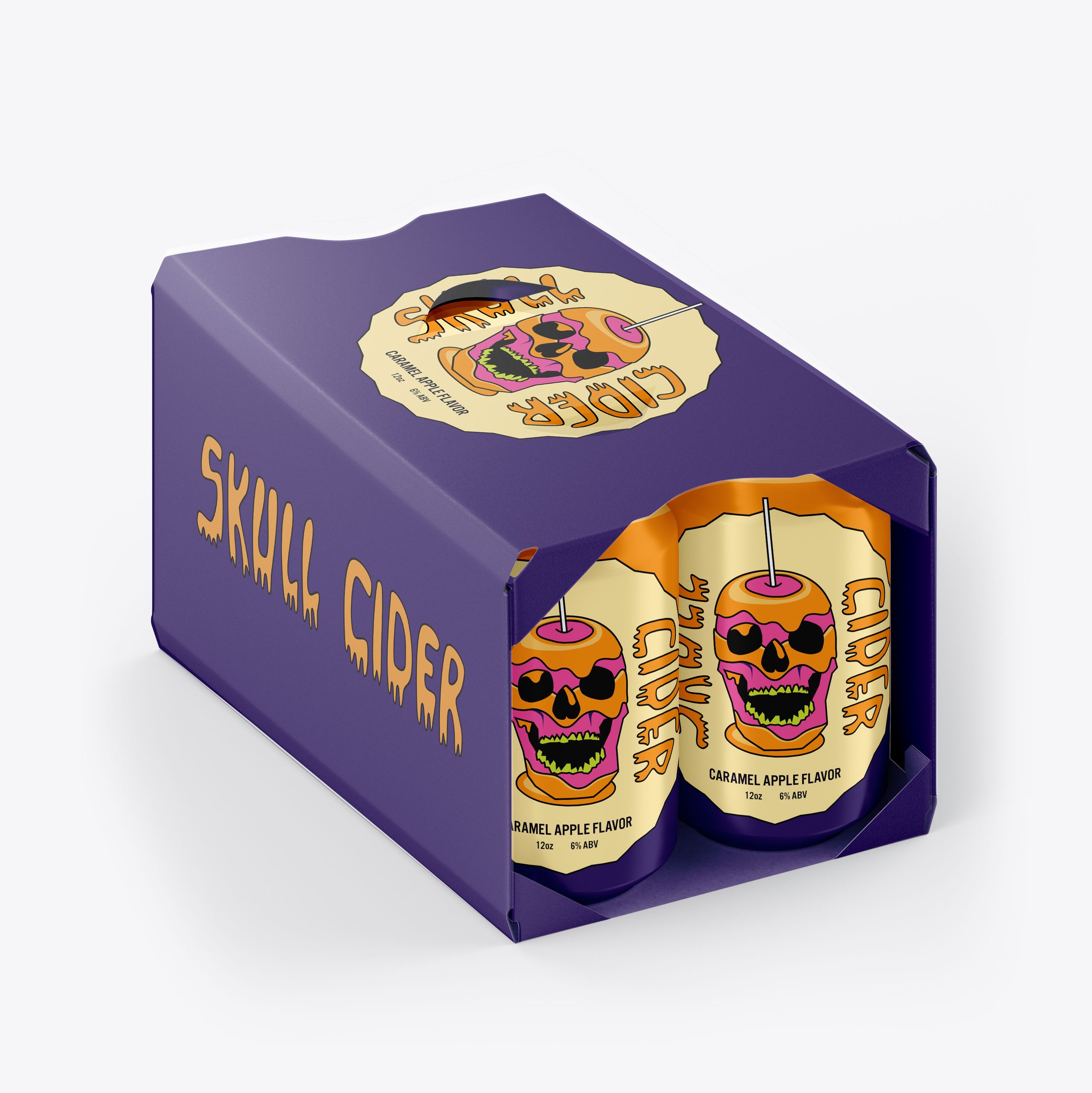
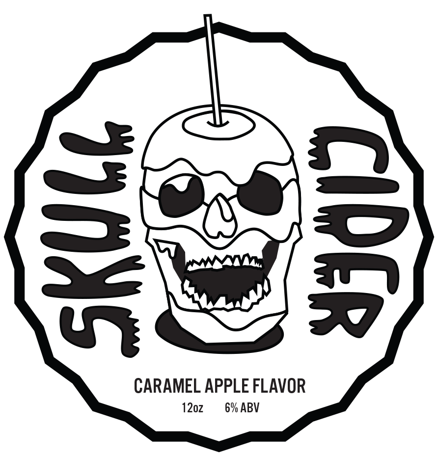
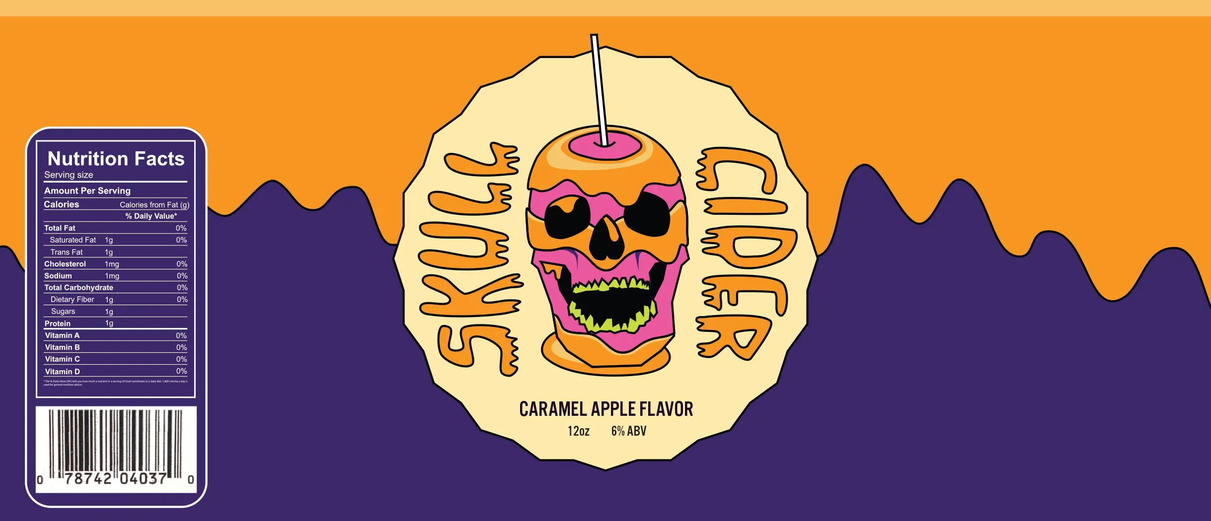
This project is a branding and packaging design for a seasonal caramel apple cider, focusing on building a cohesive visual identity across multiple formats. The goal was to combine playful illustration with a bold, Halloween-inspired color palette to create a distinct, shelf-ready brand.
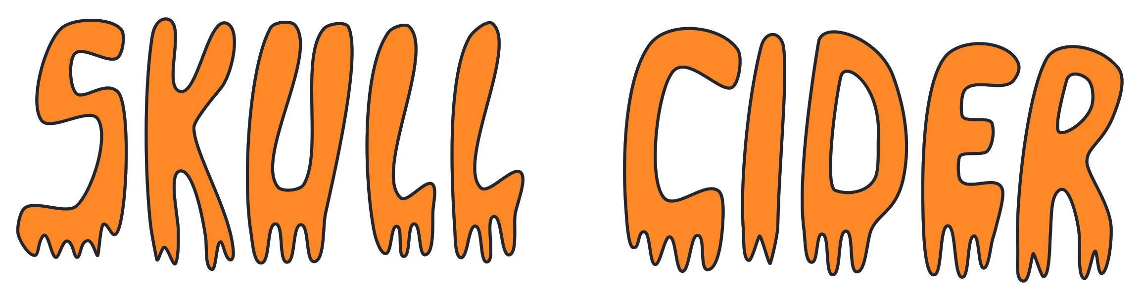
The centerpiece of the identity is a custom-illustrated "Caramel Skull" logo, which I paired with expressive, melting typography that mimics the sticky texture of a real caramel apple. I carried this visual language across both the can wrap and the box packaging. The final result is Skull Cider, a brand designed to stand out on the shelf with a look that is equal parts spooky and whimsical.

Make it stand out.
It all begins with an idea. Maybe you want to launch a business. Maybe you want to turn a hobby into something more. Or maybe you have a creative project to share with the world. Whatever it is, the way you tell your story online can make all the difference.

Make it stand out
It all begins with an idea. Maybe you want to launch a business. Maybe you want to turn a hobby into something more. Or maybe you have a creative project to share with the world. Whatever it is, the way you tell your story online can make all the difference.

Make it stand out.
It all begins with an idea. Maybe you want to launch a business. Maybe you want to turn a hobby into something more. Or maybe you have a creative project to share with the world. Whatever it is, the way you tell your story online can make all the difference.